
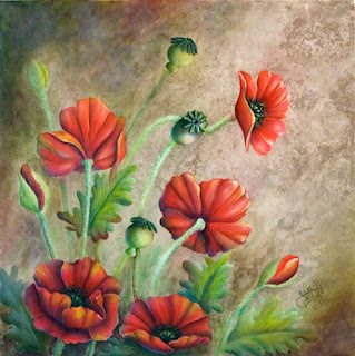
After posting my poppies and getting some feedback which confirmed some thoughts I had, I noodled some more with my painting and here’s the latest version…
 |
|
| Poppies Version 2 |
I think it has more depth and definition. Some of the changes I made included:
- darkening upper right and lower left background
- darkening the bottom 2 poppies
- toning down some of the back stems
- stronger highlights on the upper right poppy
- adding some more shading to contour the middle 2 poppies on the left side away from the light source
- adding some more ruffles in all the poppy petals
It’s funny how you think something looks pretty good, then you enhance it a bit more and it takes it to another level. I’m thinking I’ll do one more set of tweaks before calling quits to this one.

 Login Status